Able.
Able is an educational app designed to foster a diverse learning experience allowing for personalised adjustments tailored to each student's unique needs. This project focuses on the brand identity and brand website design
Process
Illustrator, Figma, VS, Photoshop
Roles
UX, UI, Graphic Design, Brand Identity
Timeline
8weeks
Mission Statement
In today’s diverse educational landscape, many students with unique learning needs are left without the tailored support they require. Able’s mission is to revolutionise education by providing a personalised, inclusive learning experience that empowers every student to reach their full potential.

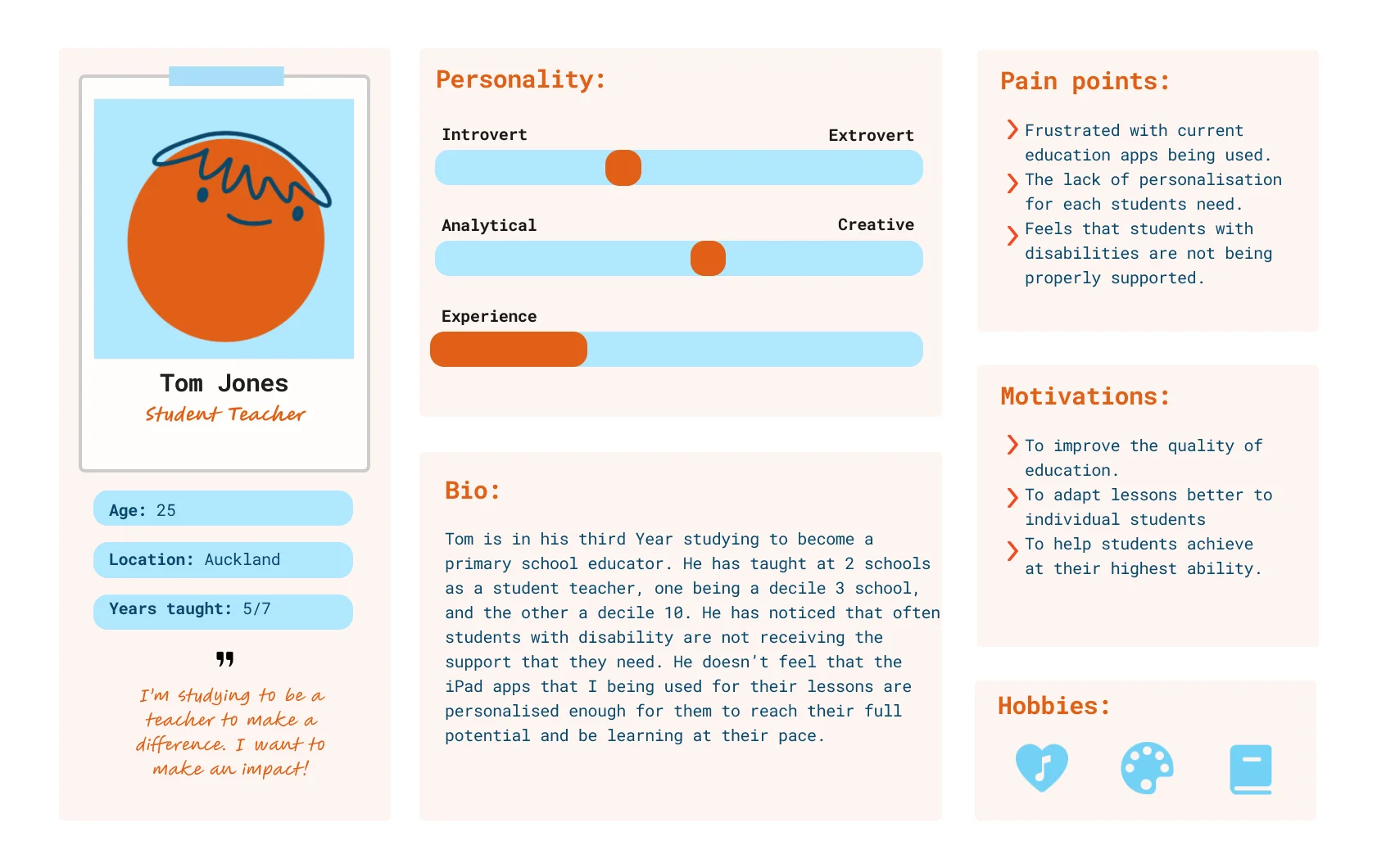
Target Audience
Primary school educators of diverse genders and age groups, seeking affordable, tailored educational tools for diverse learners.
Research
Primary:
- Empathy interviews with teachers revealed a lack of training and understanding for diverse learners. This deficiency often leads to undiagnosed learning disabilities, resulting in frustrated students unable to achieve their true potential.
Secondary:
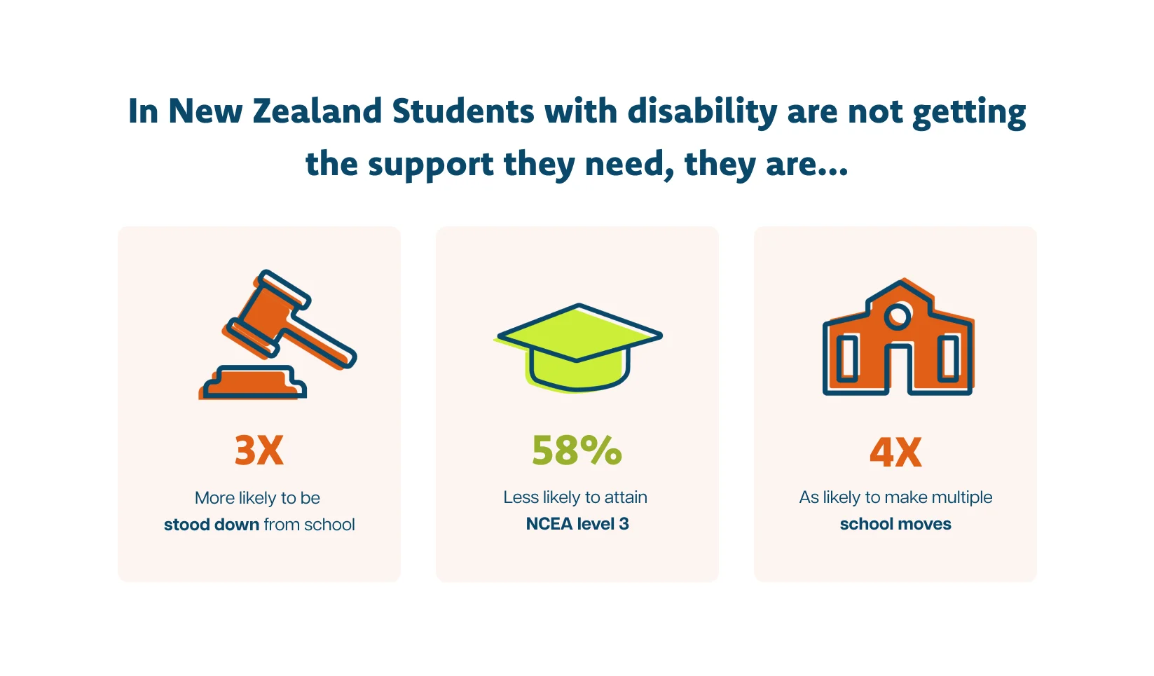
- Ministry of Education reports on the educational experiences of disabled learners showed diverse learners face higher suspension rates and lower achievement levels.
Visual Design
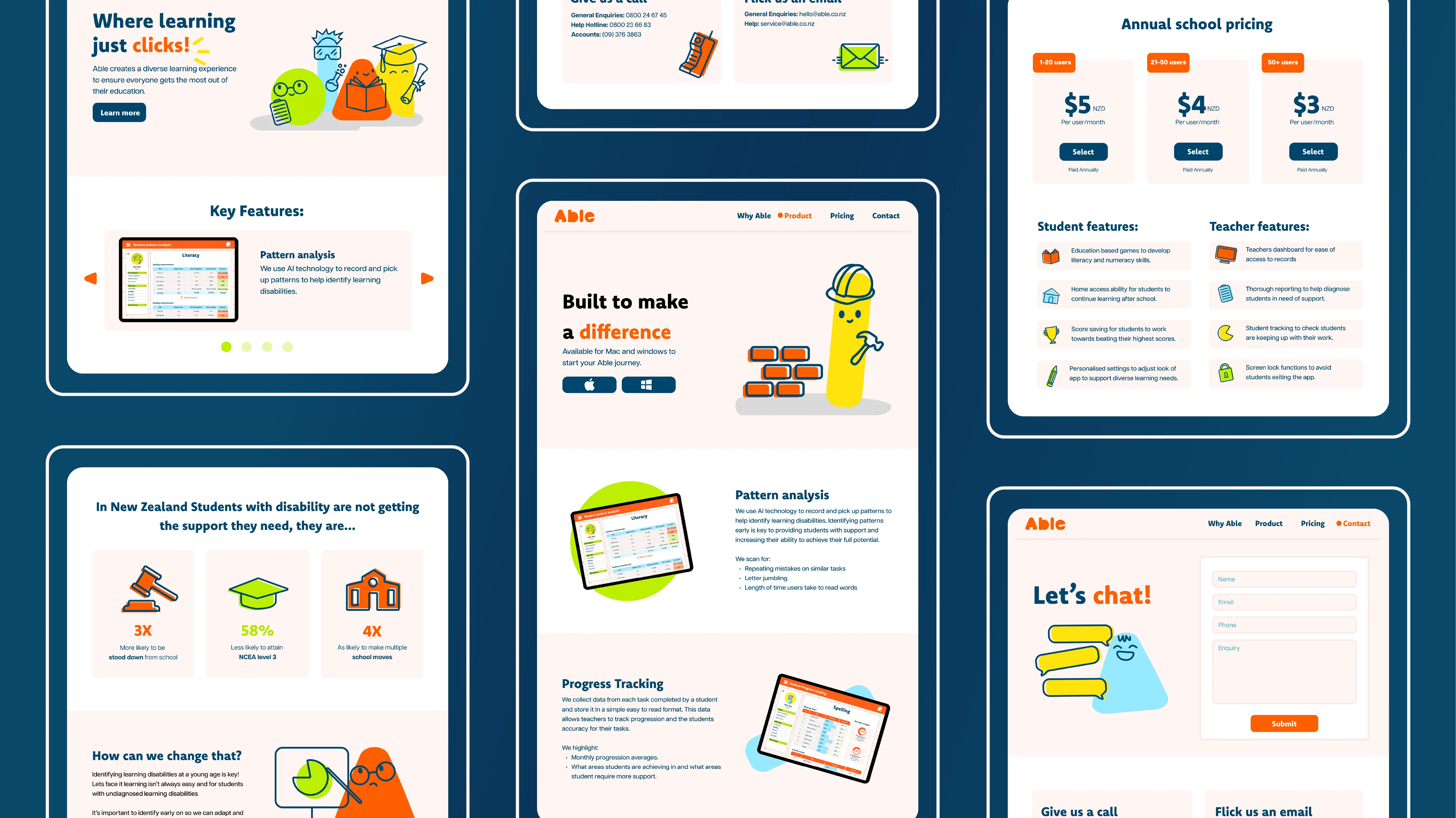
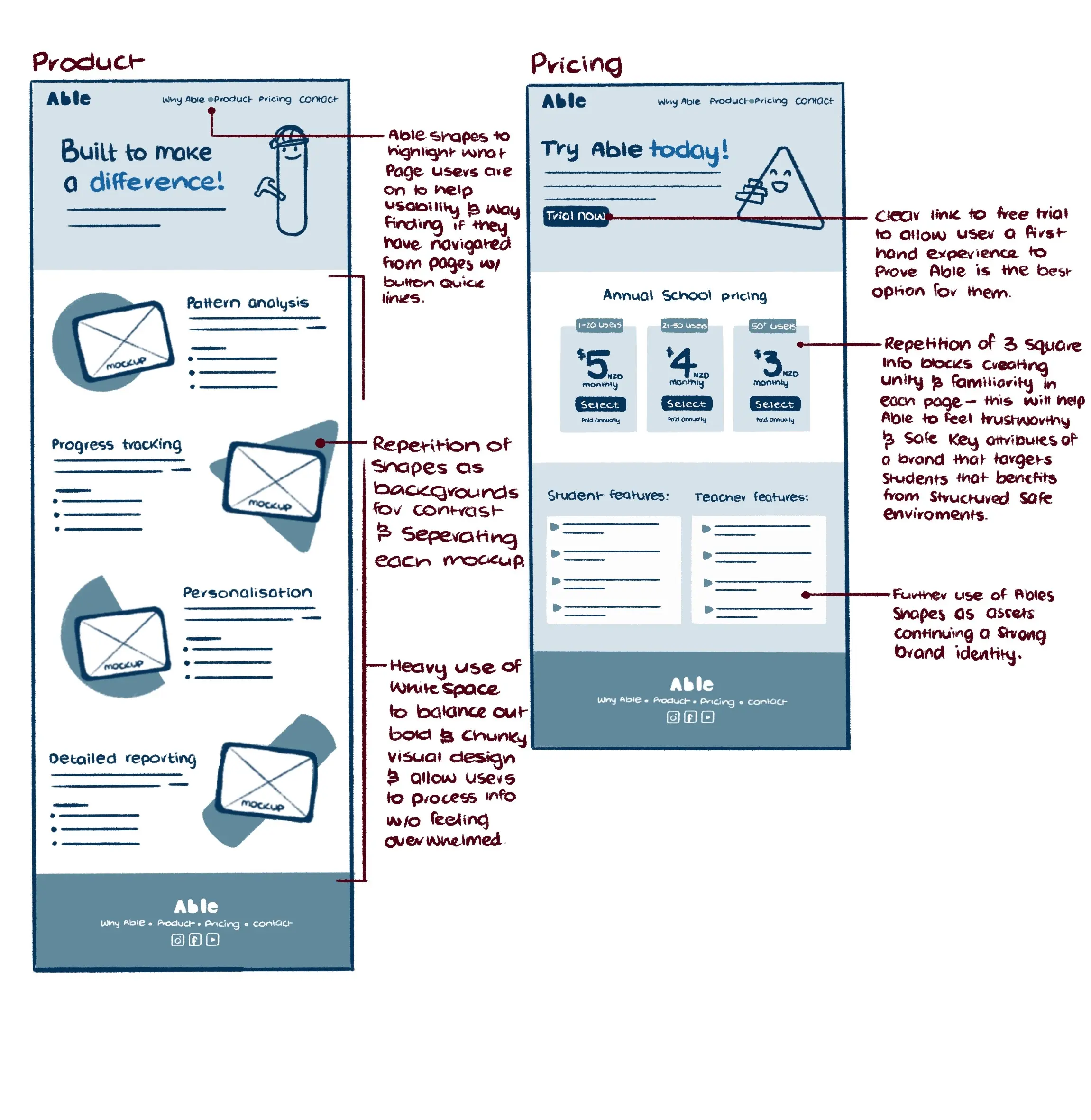
Using a balance of vibrant colours and bold shapes against neutral backgrounds, with ample white space, creates a playful yet professional look suitable for both children and adults.
Character Design
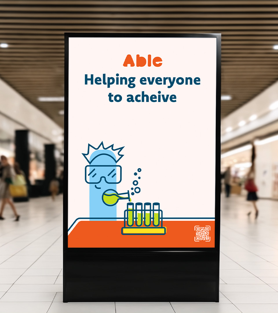
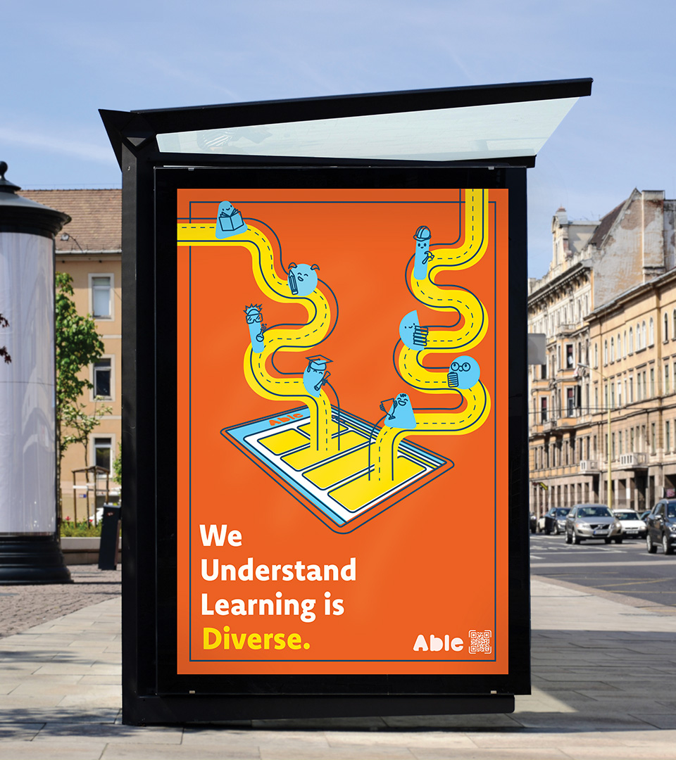
To describe how Able's signature characters came to be, we first need to start with the brand's logo. Our simple wordmark is a subtle nod to those classic alphabet building blocks found in most childhood bedrooms. We then stripped back their look to bold, chunky letters as a metaphor for the brand's drive to continue building children’s skills as they grow and mature, much like our logo.
This theme of transformation flows into the logo's typography, which is reshaped into our characters' simplified geometric forms. By repeating these core shapes, Able's visual design creates a sense of unity and familiarity within the brand's identity—a key value, as our app users often benefit from safe and familiar spaces.
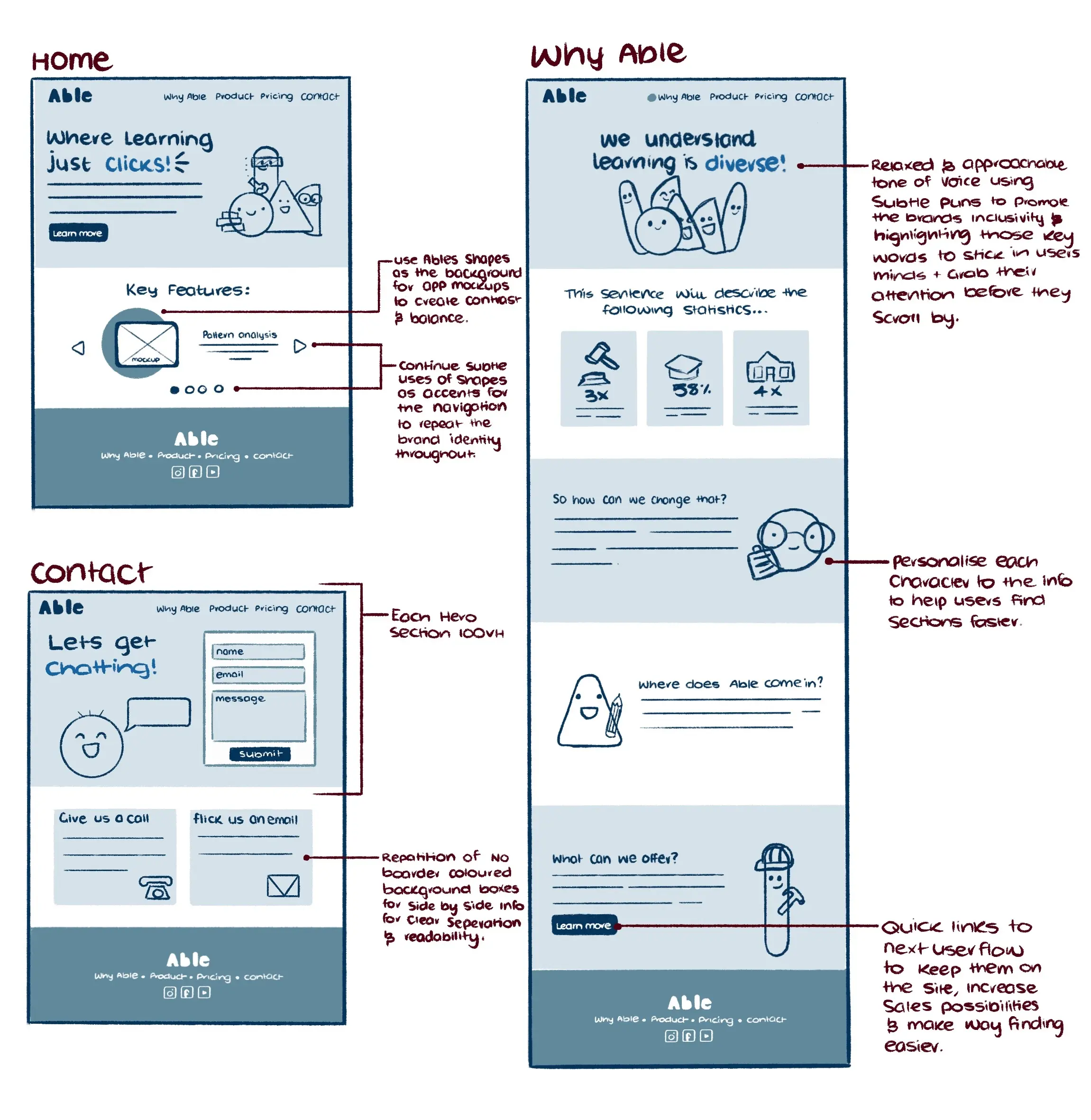
Able's team of characters serve as friendly guides within the brand's website, marking each section of information as themed visual identifiers to improve wayfinding for those who connect better with imagery than text. These characters then continue their journey into the app itself to enhance user engagement and provide tips and support during learning activities.
Concept sketching
During our field research, we noticed that many of Able's competitors shared common challenges with rabbit-hole navigation and information overload. Given that the main selling point of a disability-targeted app should be making things easier, we felt it was crucial for our website to reflect Able's straightforward design.
To create a more user-friendly site, we strategically placed touchpoints throughout the website to guide users to their next natural step. Information was kept short, sweet, and most importantly, digestible. There was no need for excessive jargon, as Able's key selling point is to analyse problem areas for the user. However, we did retain some necessary terminology but made sure to include plenty of white space for easy processing, setting us apart from our competitors.
First prototype
Positive feedback:
- Colour palette works well.
- Information is laid out nicely and easy to find.
- Easy to navigate, everything leads well into the next step.
- Playful design without feeling too childish.
Improvements:
- Hero images feel empty somehow.
- Footer image is too large, play with the sizing, and social media icon spacing needs work.
- Make hero text smaller for better hierarchy.
- Student and teacher features feels a little empty.
- Green text is too hard to read.
Hi Fi prototype
After receiving user feedback and conducting testing, significant improvements to the high-fidelity prototype were made. The changes included adding shadows to the hero characters to enhance contrast and overall appearance, adjusting text sizes to improve balance, and replacing bullet points with illustrative infographics for a more playful teacher and student features area.
Marketing and Campaign Strategy:
In addition to designing Able’s product website, I developed an engaging campaign to increase brand awareness and drive the adoption of the Able app among educators. The campaign aimed to showcase Able’s commitment to personalised and inclusive learning through thoughtful messaging that reflects the brand’s core values. By leveraging dynamic characters and clear, value-driven copy, the campaign aimed to capture educators’ attention and highlight the app’s potential to transform the learning experience for diverse students.
Campaign Timeline:
The campaign launches during the Christmas holiday break, just after the New Year. This timing allows teachers to engage with the advertisements in a more relaxed setting, as they prepare for the upcoming school year. Posters and social media ads will be rolled out to introduce new tools and resources to educators. As teachers return to school before students, promotional pamphlets will be sent out to ensure schools are fully informed about Able. The campaign will conclude at the end of April, giving the Able team time to analyse engagement and plan their next campaign for the following year.
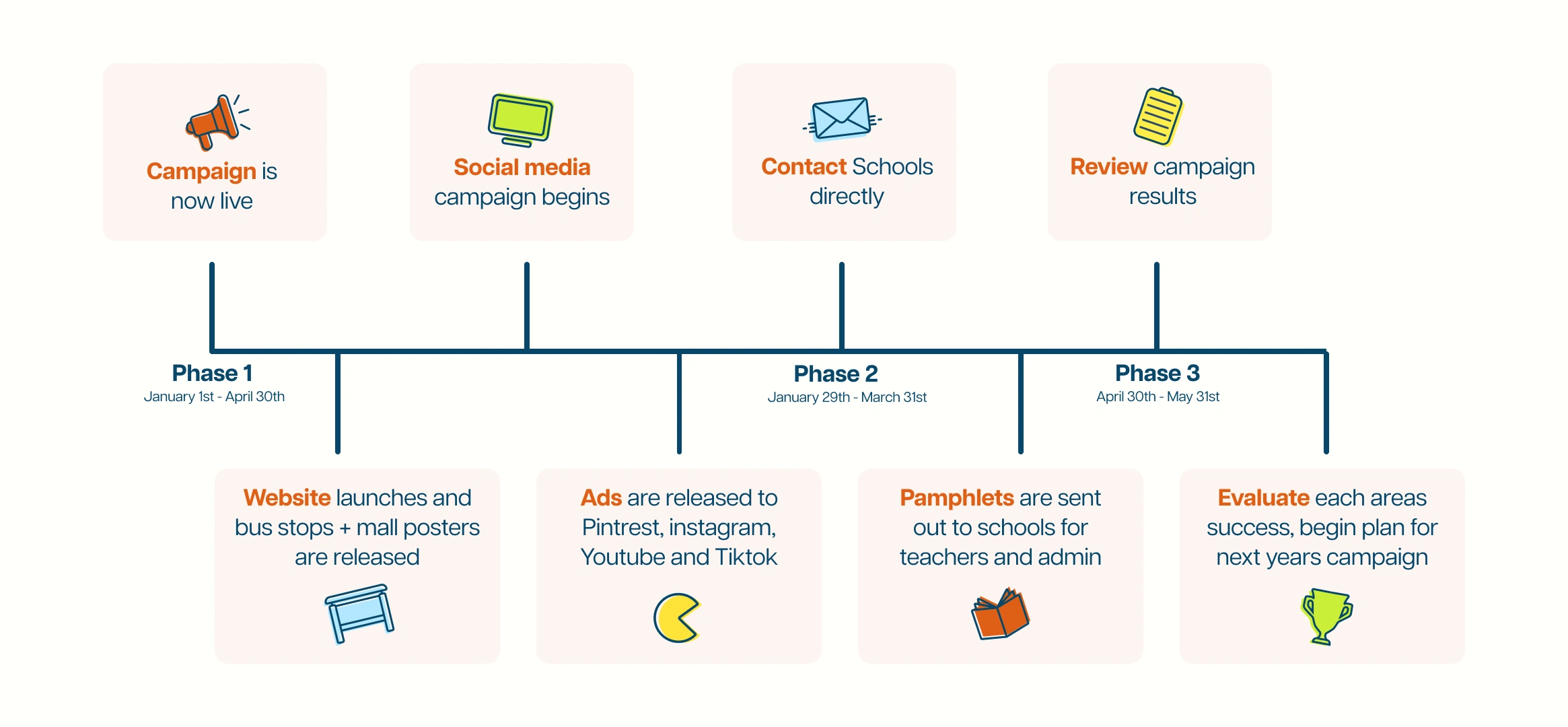
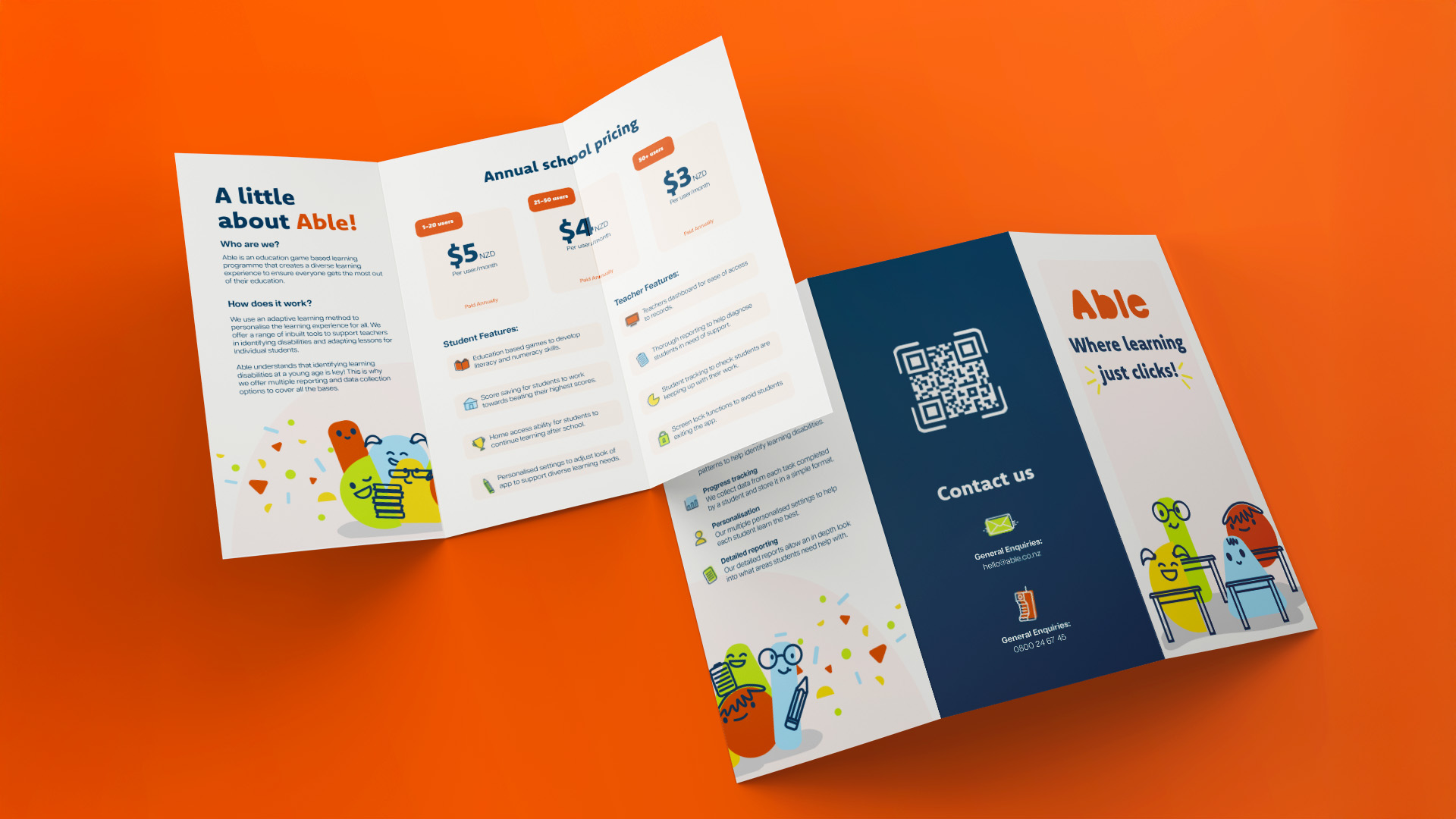
Campaign Collateral:
The campaign leverages Youtube, Instagram and Pintrest ads targeting teachers seeking creative classroom resources.
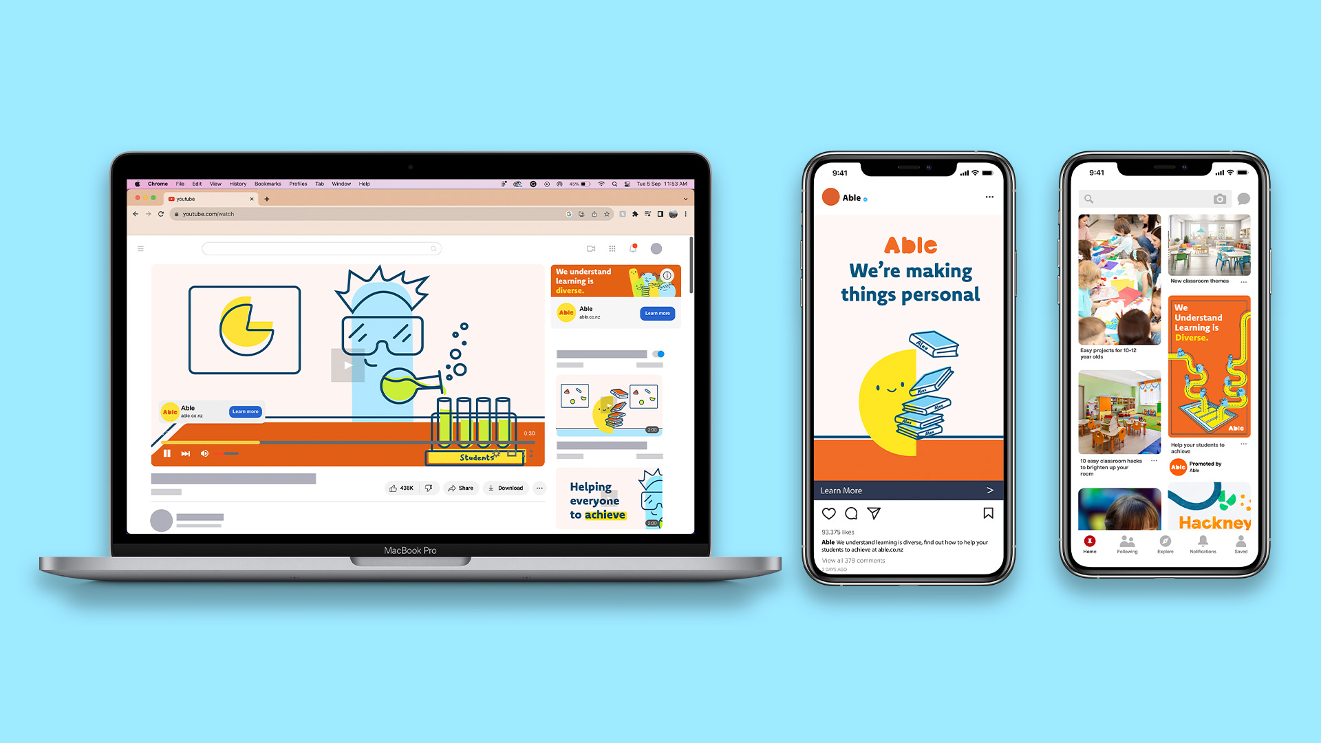
Posters emphasising Able’s core values will be scattered throughout malls and at bus stops near schools to grab the attention of parents and teachers.
The Future
To further refine this project, refining the usability of colors would be key, this would ensure they reflect the brand’s inclusivity mantra and are accessible to everyone, regardless of visual limitations. The overall aim is to edit the color scheme to enhance visibility and inclusivity for all users.
Additionally, extending branding by creating a secondary website viewing option specifically for colorblind users. This involves diving deeper into research to tailor the website to their needs effectively.
In terms of development, an aspiration is to create Able's application user interface, bringing the entire project to life. This includes designing the full experience, from children's gameplay to teacher report tracking. There would also be interest in exploring how AI can be integrated into an educational environment to improve learning outcomes, enable teachers to track student progress more effectively, and provide better support for children in need.